watercolor wood grain...
Hello my fabulous friends!
Today I wanted to play around with backgrounds... I used to do backgrounds all the time on my cards, then I fell in love with the simple clean look of plain white space... I guess I just like switching things up every once in a while!
Paper: Strathmore Bristol Smooth; Coredinations
Stamps: Essentials By Ellen Mondo Peony, Fancy Thanks
Ink: VersaMark; Distress Ink Pumice Stone; VersaFine Onyx Black; Zig Clean Color (in order of use) Flesh Color (071), Pale Rose (230), Purple (082), Lemon Yellow (082), Light Green (041), Olive Green (043), Green Gray (093), Light Gray (091)
Other: clear embossing powder
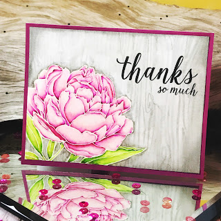
My colors were inspired by this month's Ellen Hutson Pin-sights Challenge. I wanted to use the pink as my main color, but pull in that raspberry purple into my shadows. And I loved the bright green of the leaves in the photo, so I tried to mimic that in my card.
I started by stamping my image in VersaMark ink onto Bristol smooth paper, and heat embossing with clear embossing powder.. I loved doing this when I'm watercoloring with the Zig Clean Color markers.
Maybe I'm weird, but when I first start coloring an image, I don't like it.. (for a long time I would quit at this stage thinking that it was ruined, now I keep going, knowing it will be fine)
After getting a couple colors down, I start liking it...
Then, when I'm about to add in my deepest shadows, I start second guessing myself... What if I mess up now? I like how it looks now, what if I don't like it once the next layer is added?
I try not to let that stop me either, because adding that extra bit of contrast in there really makes the image pop!
One of the best tips I've gotten for both watercolors and alcohol markers is that you shouldn't give up on an image too soon.
I wanted to add a background at this point... I loved the weathered wood in the inspiration photo, and wanted to try to recreate that.
So... Here's how I do a wood background with Zig Clean Color Real Brush Makers...
Scribble some ink onto an acrylic block (or other non porous surface). Because I'm going for a weathered wood look, my base color is Green Gray (093). It's a darker gray, but we'll be using so much water it will end up a lot lighter in color.
Using a wet flat brush, pick up some of the ink from the acrylic block and cover your background with color... If the color is too dark or doesn't flow easily across your paper, add more water. If you want a darker color, add more ink, or let this layer dry and do another layer.
It doesn't need to be a perfectly smooth wash... wood isn't a perfect solid color... To avoid getting harsh lines, keep your leading edge (the edge between where you have painted and where you haven't) wet... if the ink drys it can be hard to get rid of the hard line.
Let it dry... Sometimes it's hard to tell exactly what it will look like while it is still wet, so letting it dry between layers helps you gauge if you need more color or not.

I wanted to add a bit more contrast right around the flower, so I took the marker directly to the paper and scribbled in some ink around the edges of the stamped image.
I then took a small round brush with lots of water and blended it out.

If you do this, you can avoid a weird water line around your image, by using a paper towel to blot up any standing water.
When your background is completely dry, draw in your wood grain... it's just lines and knots...
Every piece of wood is different... The pattens and widths of you lines can vary as much as you want.
You can leave it like this if you want.
I wanted the background to be a soft so the focus stays on the flower and the sentiment, so I just took my flat brush and lightly went over the background with clean water. Don't scrub it, or your lines will disappear.. Just do a light wash of water to soften the lines. I put more water on some areas than others to create variation and a distressed look.
I finished it off by adding a little Pumice Stone Distress Ink around the edges using an ink blending tool to form a vignette, and added a sentiment. After that I just mounted it on a raspberry card front, keeping it nice and simple.
Wood grains are a fairly simple thing to watercolor since they can vary dramatically and still read as wood. Give it a try sometime!
Enjoy!
~Kassi


Comments
Post a Comment