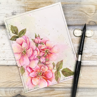
Fairy tale flowers...
Hello my fabulous friends,
and welcome to all who are new!
I was in the mood to paint something messy and colorful today, and bright happy flowers seemed like the perfect way to start the weekend!
Stamp: Altenew Fairy Tale Florals
Ink: Inkon3 Fadeout
Color: watercolor
This is an older stamp, but one of my favorite Altenew stamps in my collection, and decided to use it for the Altenew May Inspiration Challenge.
I love the color variations in the tulips! I know they have simplified the color palette to 3 colors, but the photo spoke to me more- probably because I'm in love with complex color palettes right now.. the unexpexected pops of yellow or purple in an otherwise pink flower... the shift from fuchsia through pink and into coral... It excites me!
Choosing colors for me is about more than just the colors themselves... it's about the personality of the colors. This is why I have SO many colors and so many brands in my color library. You can have a color from 2 different brands that look exactly the same color wise, but one moves like crazy in water, and the other stays where you put it. Or one might granulate while the other doesn't. I like having options.
PLEASE NOTE: You do NOT need this many colors to paint. I'm a bit of a color nerd, and have been collecting colors and brands for years. LOL. You can do incredible work with just 3 colors in your palette.
Once I think I have my colors figured out, I like doing some test swatching- where I can test my colors and planned techniques on the same paper I plan to use for my actual project.
(in this case, Arche Cold Press watercolor paper)
Free hand flowers are a fun and easy way to swatch- especially if I'm planning on painting flowers as it gives me a good idea of what it will look like, but not all my swatches look like this... sometimes they are just messy blobs of color.
After a few adjustments to both my color choices and my technique, I settled on:
Pink: QoR Qinarcridone Magenta (for the bright color and crazy movement)
Yellow in petals: Masha's Bright Yellow (for the bright color and the way it mixes with the pink)
Purple shadows: Masha's Viola (for the way to pushed the pink towards purple, and color separation)
Green: Masha's Shadow Green Dark (for the color separation, and the way it blends with the other colors)
Yellow in center: Masha's Tiger Eye (for the dark granulation)
Brown: Masha's Tree Bark (for the color separation and the fact that it leans green)
I did use masking fluid to mask out my stamen before starting to paint, but I didn't mask the flowers before painting the background. I have started using the light mottled background colors as an underpainting of sorts for my flowers... it gives extra interest and subtle unexpected shifts of color in the petals and leaves.
I hope you all have a fantastic weekend!
I'll be back with more soon... see you then!
~Kassi


Beautiful no line watercolor! You brought these florals to life, nicely done! Thanks for sharing!
ReplyDeleteSo amazing and stunning
ReplyDeleteGorgeous coloring!
ReplyDeleteSo inspiring! Your work is beautiful.
ReplyDelete