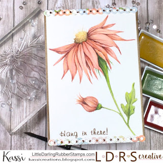
Contrast makes it pop...
Hello my fabulous friends!
Today on the LDRS Creative blog, I was musing about how different a stamped image can look depending on how it is colored...
I decided to try taking a very stylized whimsically doodled stamp and color it in a more realistic way just to see how it looked...
Paper: Canson Watercolor Paper; Georgia Pacific cardstock
Stamps: LDRS Creative Blooming Bugs, Safari
Ink: LDRS Creative Coffee Bean, Alloy
Coloring: Kuretake Gansai Tambi watercolor-
Scarlet Red, Dark Pink, Menthol Violet, Dark Brown, Black, Bright Yellow, Light Brown, Olive Green, Ever Green,
Prismacolor Pencils-
Black, White, Chartreuse, Sand, Kelp Green, Henna, Nectar, Dark Brown, Golden Rod, Tuscan Red
Copic- E17
Dies: LDRS Creative Petite Pinafore
Other: LDRS Creative Stamping Mask Paper; Rhinestones
Be sure to check out the LDRS Creative blog... There I walk you through the watercolor process up to this point.
And to be honest, this is a WONDERFUL place to stop... I just wanted to add a bit more pop with deeper contrast and details...
To do this, I pulled out my Prismacolor Pencils..
I grabbed some lights and darks, and started reinforcing the shadows and highlights.
I also added in some light yellow to some of the petals to warm it up and make it glow... Like sunlight is shining on it.
Continue to add in details and contrast until you get the look you want. Don't be afraid to us the BLACK pencil! I know it's scary, but it makes a HUGE difference! You don't need to use much black.. just little bits inside the deepest nooks and crannies.
To give the center of the flower more texture, I dotted the pencil instead of using strokes to lay down color. I kept the darkest dots near the petals, and left my lightest color in the area facing the top of the card.
I love the way the pencils add some POP to the image... It gives it a lot more dimension and definition!
To finish the card, I die cut a border out of my swatch paper, and added tiny rhinestones for sparkle... I didn't like the clear rhinestones since they felt too stark for this card, so I used a Copic marker to color them.
Again, if you want to see the watercolor part of this card, check out the tutorial I did on the LDRS Creative blog.
See you soon!
~Kassi
For more inspiration, follow me on:
*Affiliate links used when possible. This doesn’t affect the price you pay, it simply allows me to continue bringing you better content. :)


Comments
Post a Comment