Hello my fabulous friends,
and welcome to all who are new!
Last year I purchased the Altenew Artists Watercolor 24 pan set as a mid-range budget option paint set for a class I was asked to teach. I don't remember how much I paid for it, but it is currently listed on Altenew's site for $49.99. Not the cheapest watercolors around, but much cheaper than my Daniel Smith, Schmincke, and Holbein paints. And honestly, going super cheap with watercolors isn't generally the best idea.
I honestly haven't used them much since my initial tests to ensure they would work as an option for students in my class. I put my Altenew watercolors in my travel bag, but haven't been doing much traveling, so it's been gathering dust.
The other day I was cleaning up my house in preparation for guests, and I came across the Atenew palette, and decided I should give it another go... I saw the July Challenge for Altenew, and it seemed the perfect kick in the pants to put the paints to use.
Here's the the challenge image... I focused mostly on the blue, yellow, green color scheme.
Ink: Inkon3 Fadeout
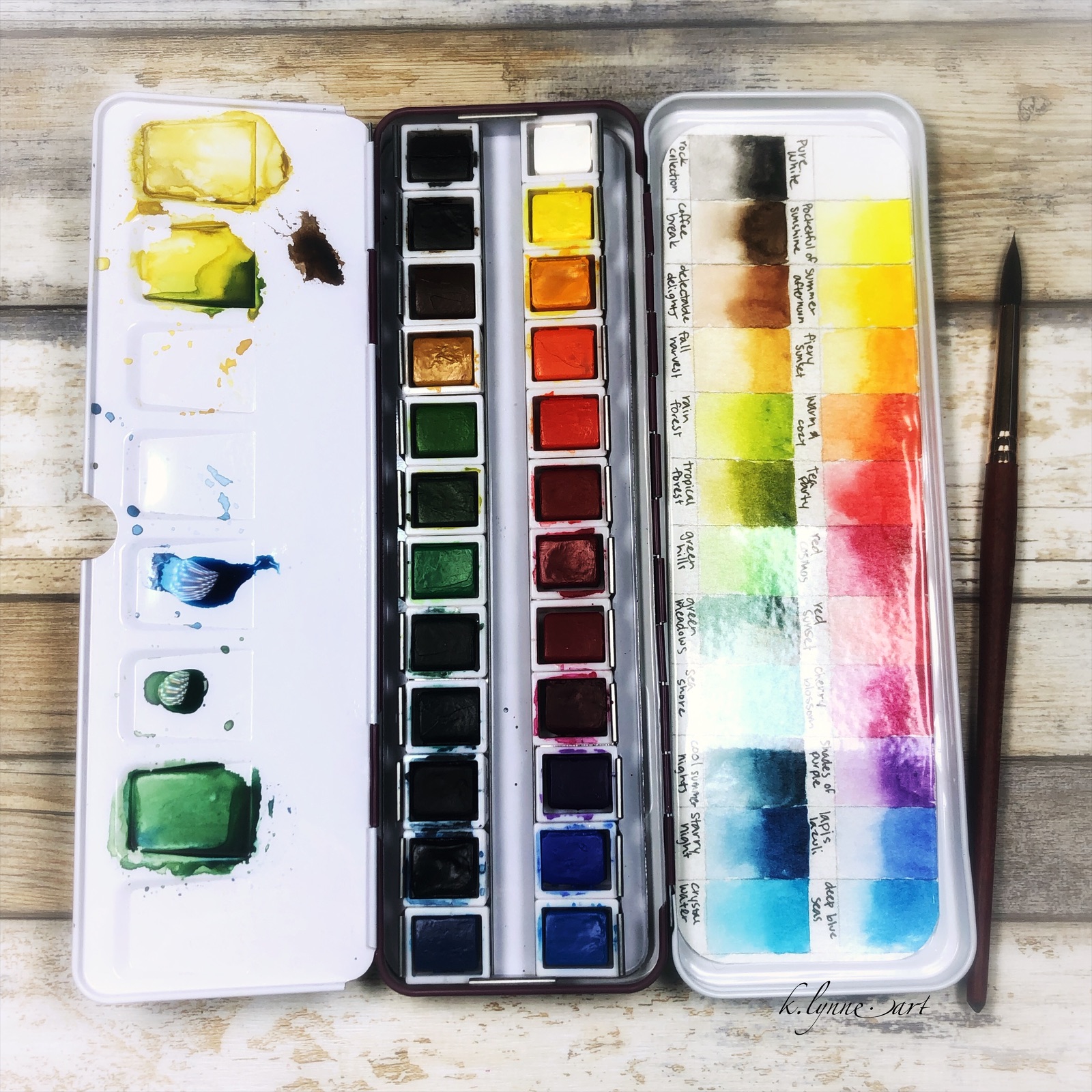
Color: Altenew
watercolors- Summer Afternoon, Starry Night, Coffee Break
I wanted to stick to a limited color palette for this, not just for the sake of the challenge, but also because it helps create color harmony. Mixing well is a quality I look for in watercolors. Low end brands often have too much filler and not enough pigment, and you get muddy mixes.
As you can see, I was able to get a beautiful green by mixing my blue and yellow together. Adding small amounts of brown to my yellow gave me the shadow colors for the petals. I was quite happy with how they mixed! I really want to to a full mixing chart with these paints just to see what they can do... Let me know if you would be interested in seeing that..
When these paints are wet, they seem to lift really easily. This makes softening colors, lost and found edges, and fixing mistakes nice and easy. Once dry, I was able to glaze over without disturbing the under layers, which was nice.
When opening the palette, the mixing tray on mine did not open all the way, so the paint puddles wanted to run back towards the hinge instead of staying in the wells...
With a little persuasion I was able to get it to angle dow so the paint pools in the wells. It still closes perfectly fine, but it will be easier to use as a mixing tray in the future.
And just for fun, here's some more color mixing with a stencil using Summer Afternoon, Starry Night, and Cherry Blossom. Those three colors create a beautiful rainbow of colors! And, they react AMAZINGLY with salt!
Over all, these paints aren't Daniel Smith, but I wouldn't expect them to be. They are beautiful and bright. I have no idea how lightfast they are, but for the purposes of card making, I don't care too much about that.. Copics aren't lightfast. If you are looking to dip your toes into watercolor, this might be a good set for you to try. I know I enjoyed painting with them today!
(and just in case you wondering, I paid for these paints myself, I was not asked to write this, nor am I being compensated in any way)
Would you be interested in seeing/testing/learning about different paints, papers, etc? Let me know if that is content you would like to see.
I'll be back with more soon... see you then!
*Affiliate links used when possible. This doesn’t affect the price you pay, it simply allows me to continue bringing you better content. Thank you for your support! :)


Comments
Post a Comment